vancouver canucks rebrand
This project was created during my Design and Typography II course, where the assignment was to redesign and rebrand an existing company or organization. I chose to reimagine the Vancouver Canucks, an NHL team I had recently become a fan of, as an opportunity to explore sports branding in a more conceptual and strategic way.
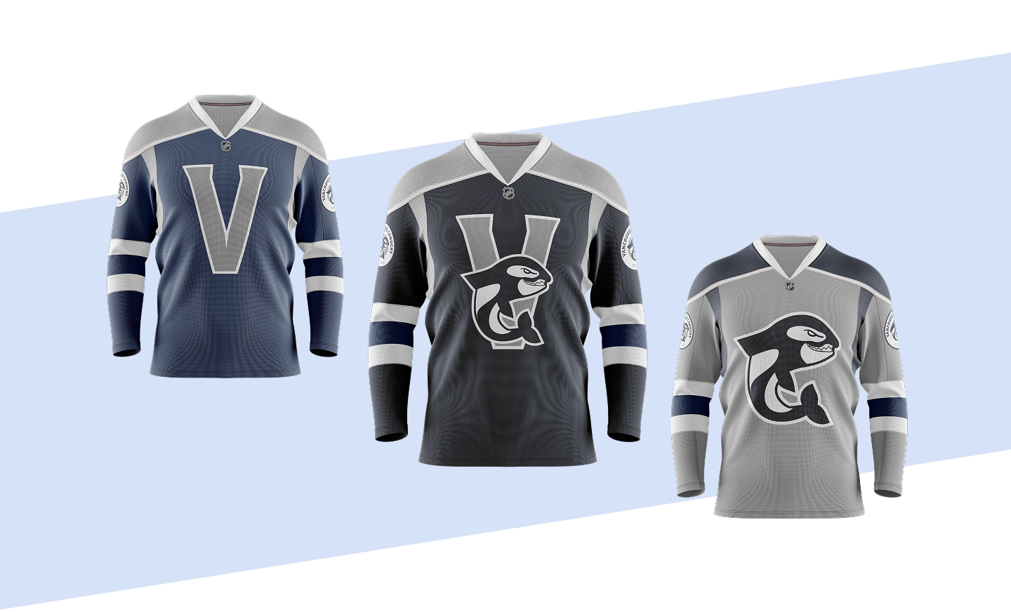
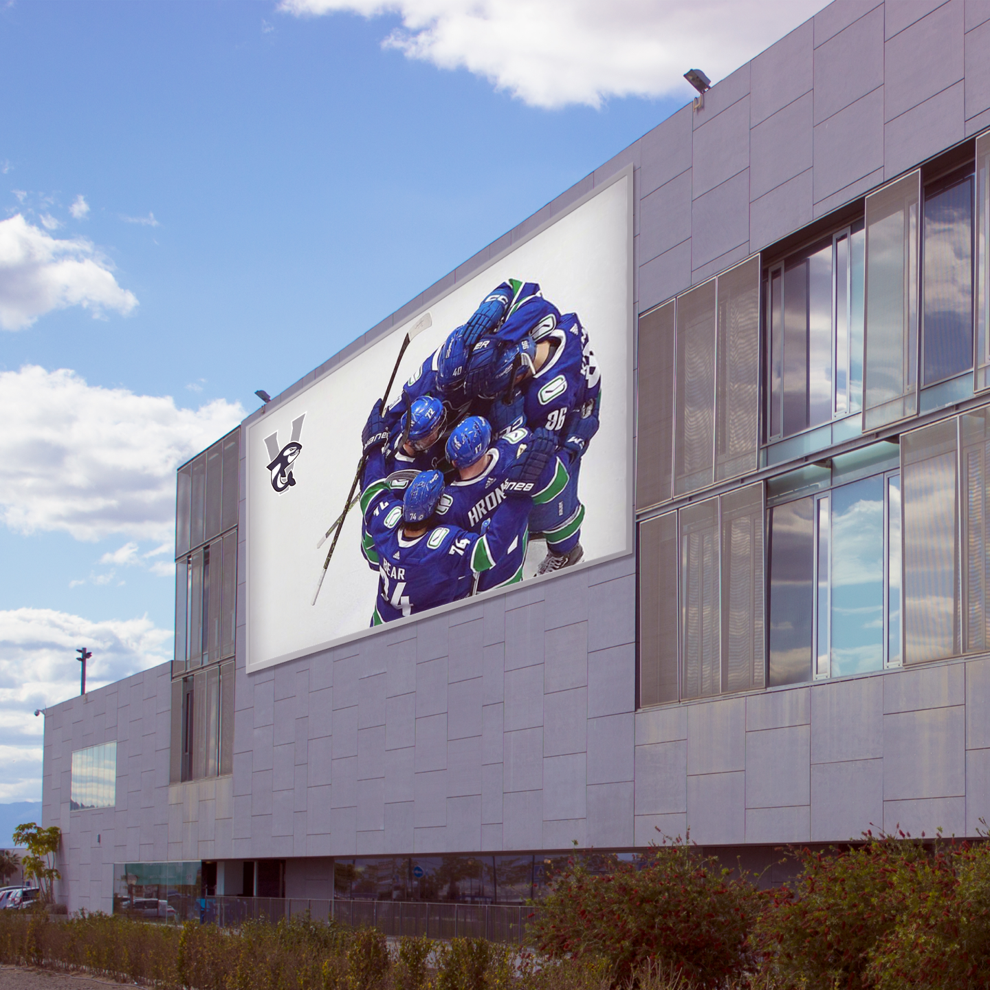
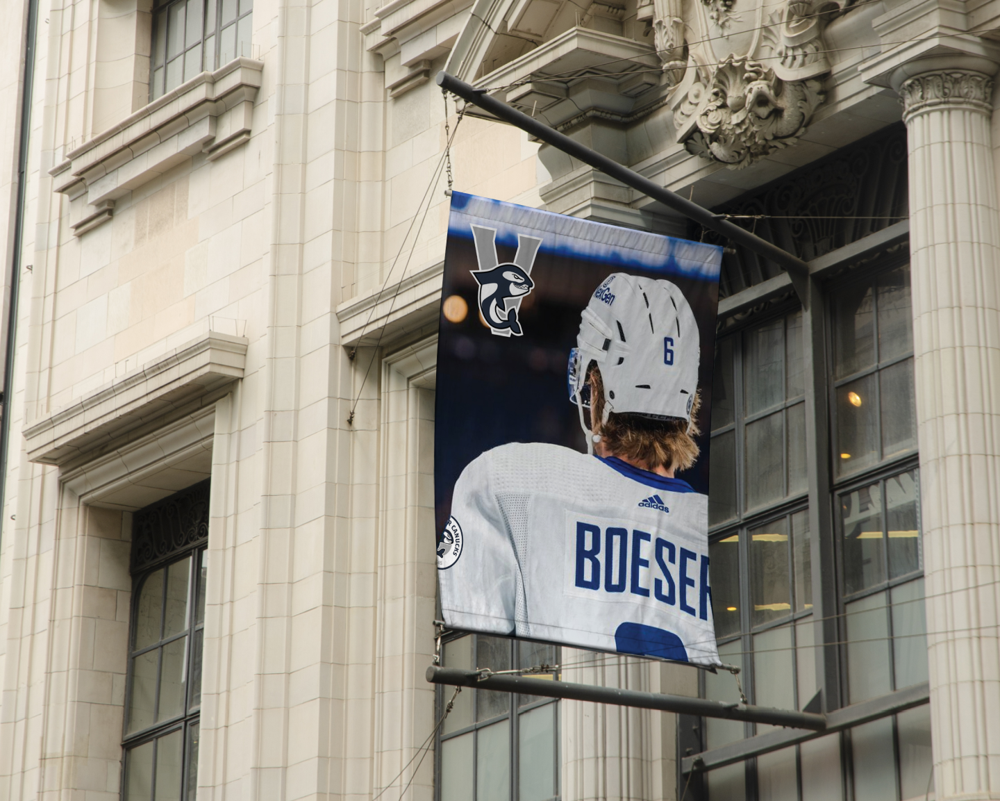
Rather than refining the existing identity, I took a more experimental approach by questioning how the team’s visual system could be reimagined. The current Canucks branding centers around the orca logo, which represents the Pacific Northwest’s marine identity and forms a stylized “C” for the team name . While this identity is recognizable, I saw potential to explore a direction that felt more dynamic and cohesive within contemporary sports design.
My goal was to create a brand system that felt both modern and rooted in the culture of hockey. I focused on developing a strong visual identity through typography, color, and logo design that could exist across multiple applications, from jerseys to digital media. This project allowed me to think beyond a single mark and instead consider how a full brand system operates within the world of professional sports.
Using Adobe Illustrator, I explored form, structure, and consistency to build a rebrand that reflects both my personal perspective as a fan and my growing interest in sports design. This project challenged me to take creative risks while working within the expectations of an established brand, resulting in a concept that reimagines what the Canucks identity could be.