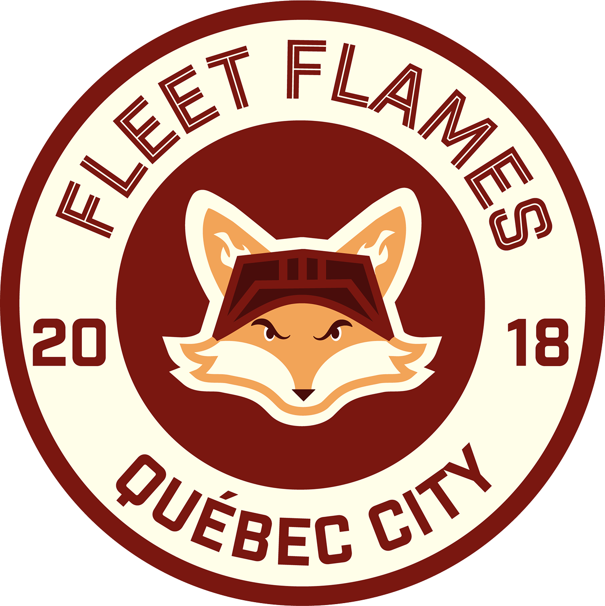
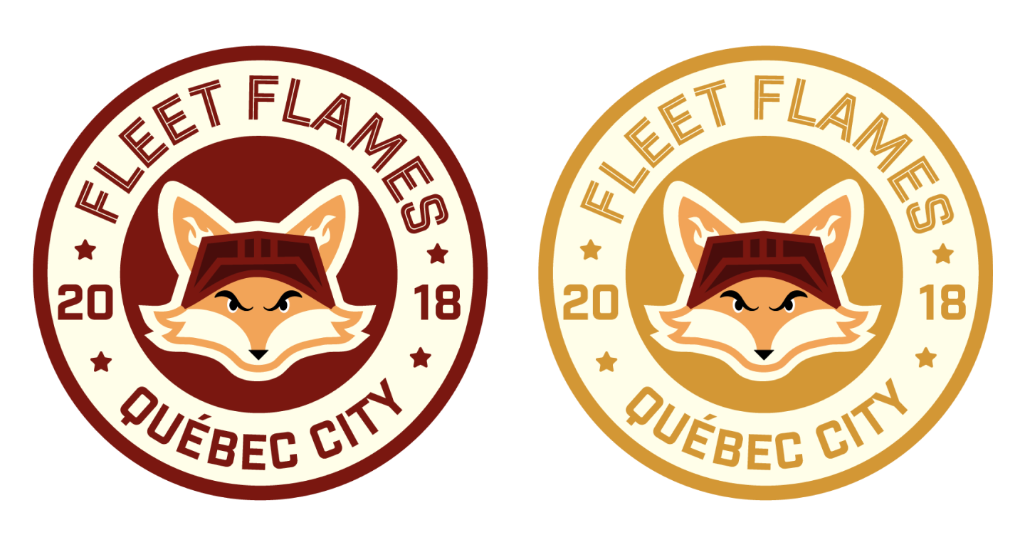
Quebéc City
Fleet Flames
This project was created during my Graphic Design I course, where the assignment was to develop a badge-style logo based on a randomized set of words and a specific location. I was given the words candle (which I interpreted as flame), fox, and hockey, along with the context of Quebec City, Canada.
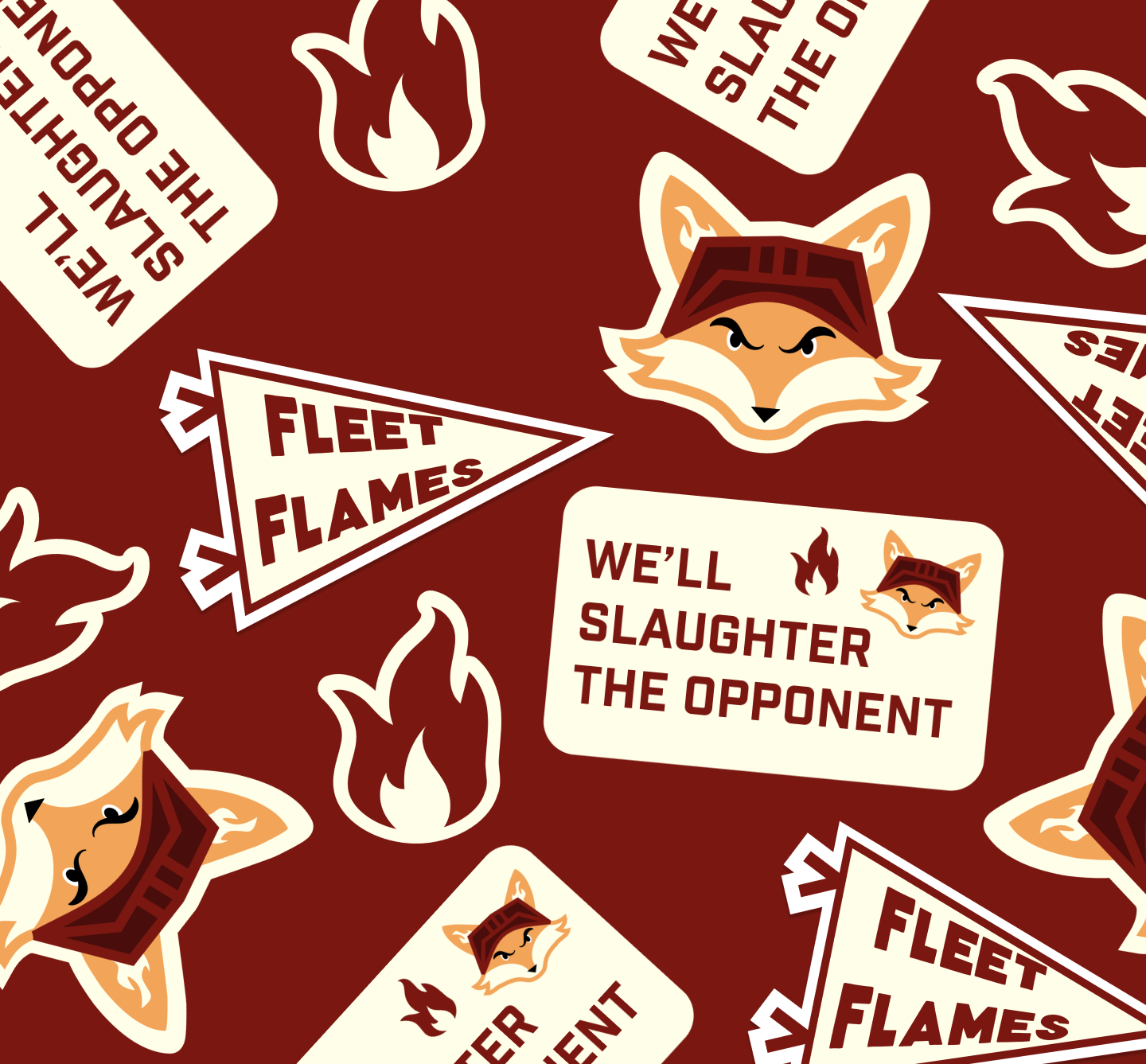
From this prompt, I developed the concept for the Fleet Flames, a fictional hockey team rooted in both regional identity and dynamic visual storytelling. I wanted the logo to feel authentic to the world of sports branding while also incorporating a unique narrative through the combination of elements. The fox became a central symbol, representing agility and competitiveness, while the flame element added motion, energy, and intensity—qualities closely associated with hockey.
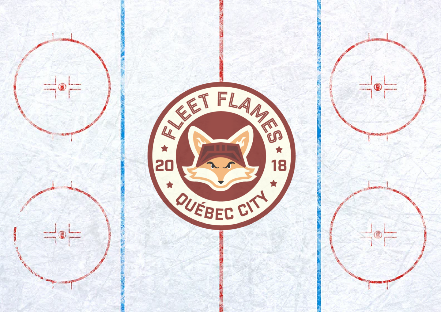
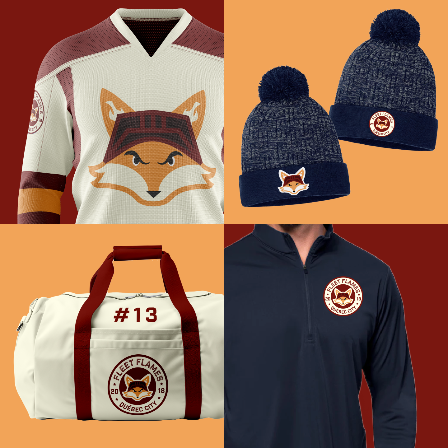
Using Adobe Illustrator, I focused on creating a strong, cohesive badge design that could function within the visual language of professional sports teams. I explored shape, symmetry, and bold graphic forms to ensure the logo felt structured and impactful, while also considering how the design would translate across different applications.
This project was both technically and conceptually challenging, pushing me to refine my vector illustration skills while working within the constraints of a structured prompt. It also allowed me to incorporate my interest in sports design, resulting in a final piece that I am especially proud of.