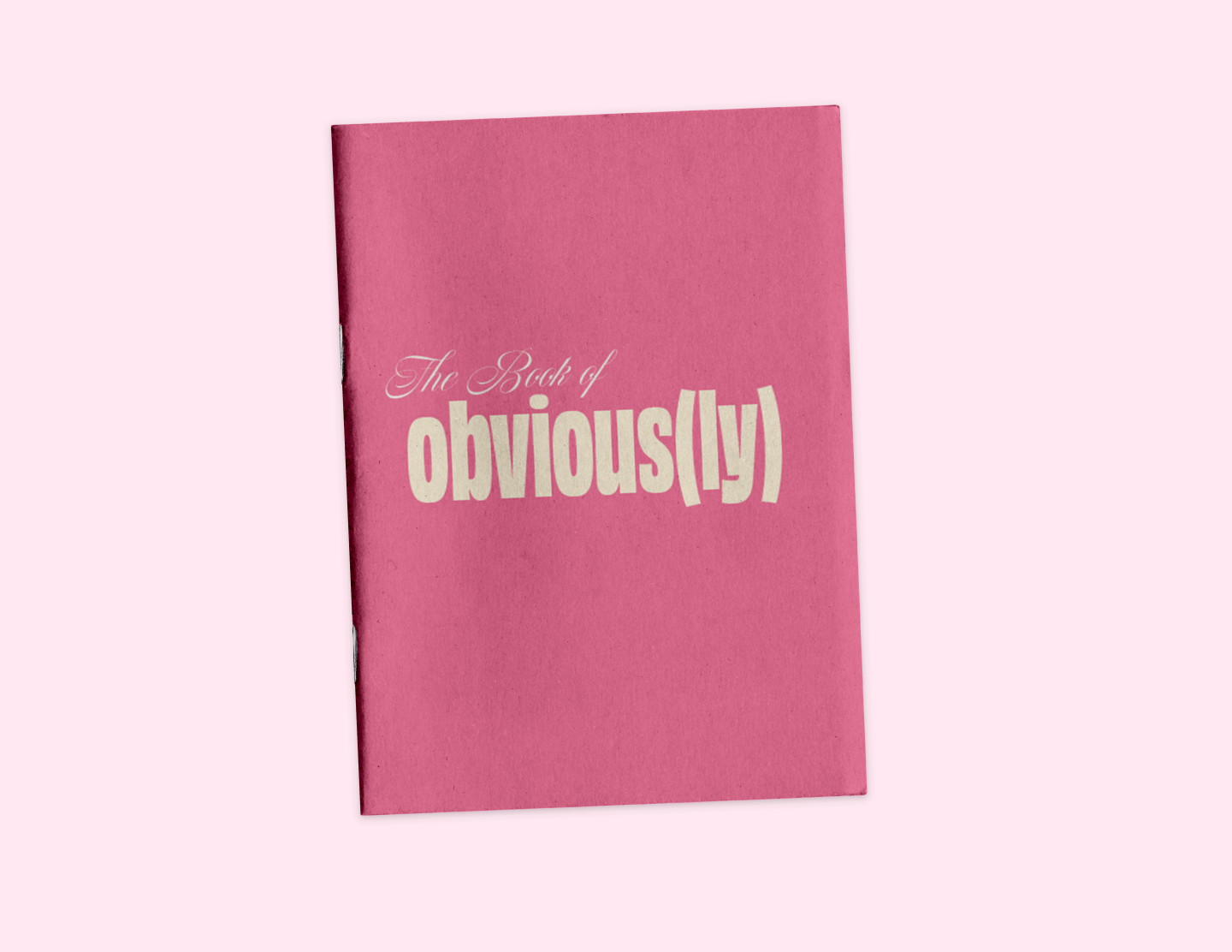
Obviously Typeface Zine
This project was created during my first Design and Typography course, where the assignment was to design a zine centered around a specific typeface. For this project, I chose the typeface Obviously, a bold and expressive sans-serif designed by the type foundry OH no Type Co. Known for its wide range of styles and exaggerated proportions, the typeface lends itself well to playful and experimental typography.
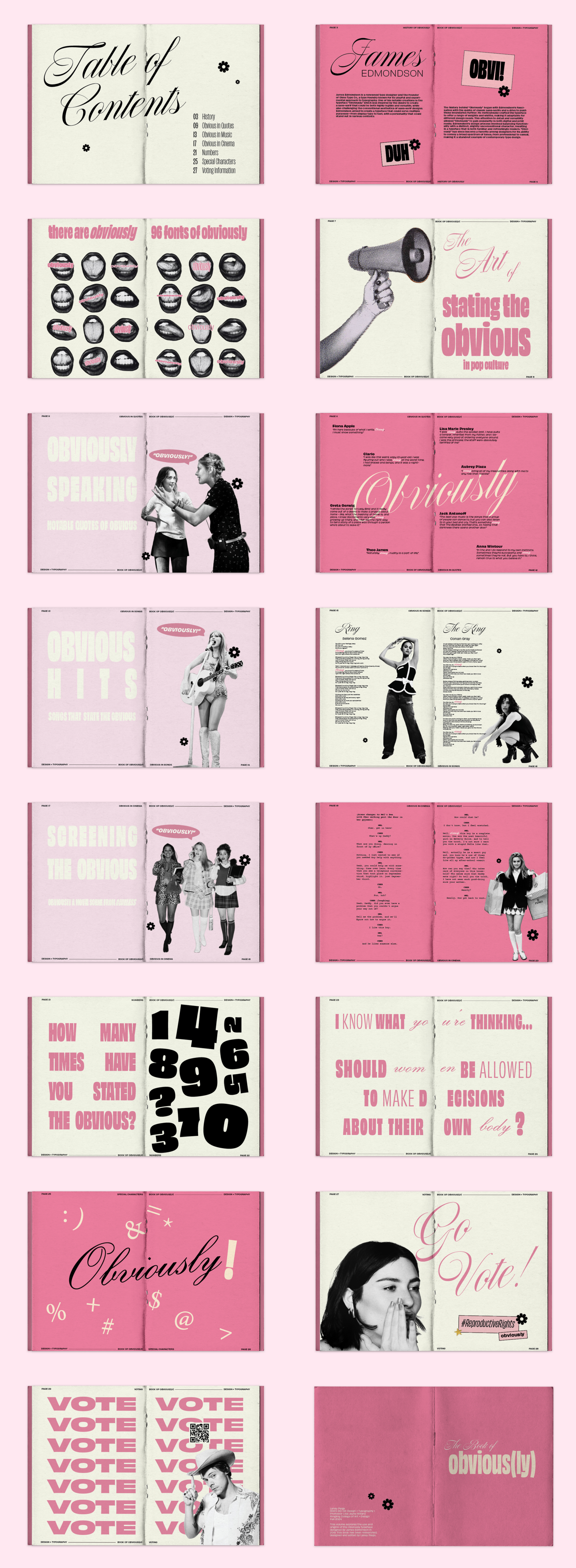
I approached the project by leaning into the name of the typeface itself—Obviously—and built the concept of the zine around humor, exaggeration, and the idea of things that are “obvious.” Rather than presenting the typeface in a purely informational or technical way, I used the project as an opportunity to experiment with expressive typography and visual storytelling. The layouts play with scale, repetition, and bold compositions to highlight the personality of the typeface while reinforcing the playful tone of the concept.
Through this project, I explored how typography can act as both content and design, using the structure of a zine to showcase the versatility and character of a typeface while creating an engaging and visually dynamic reading experience.